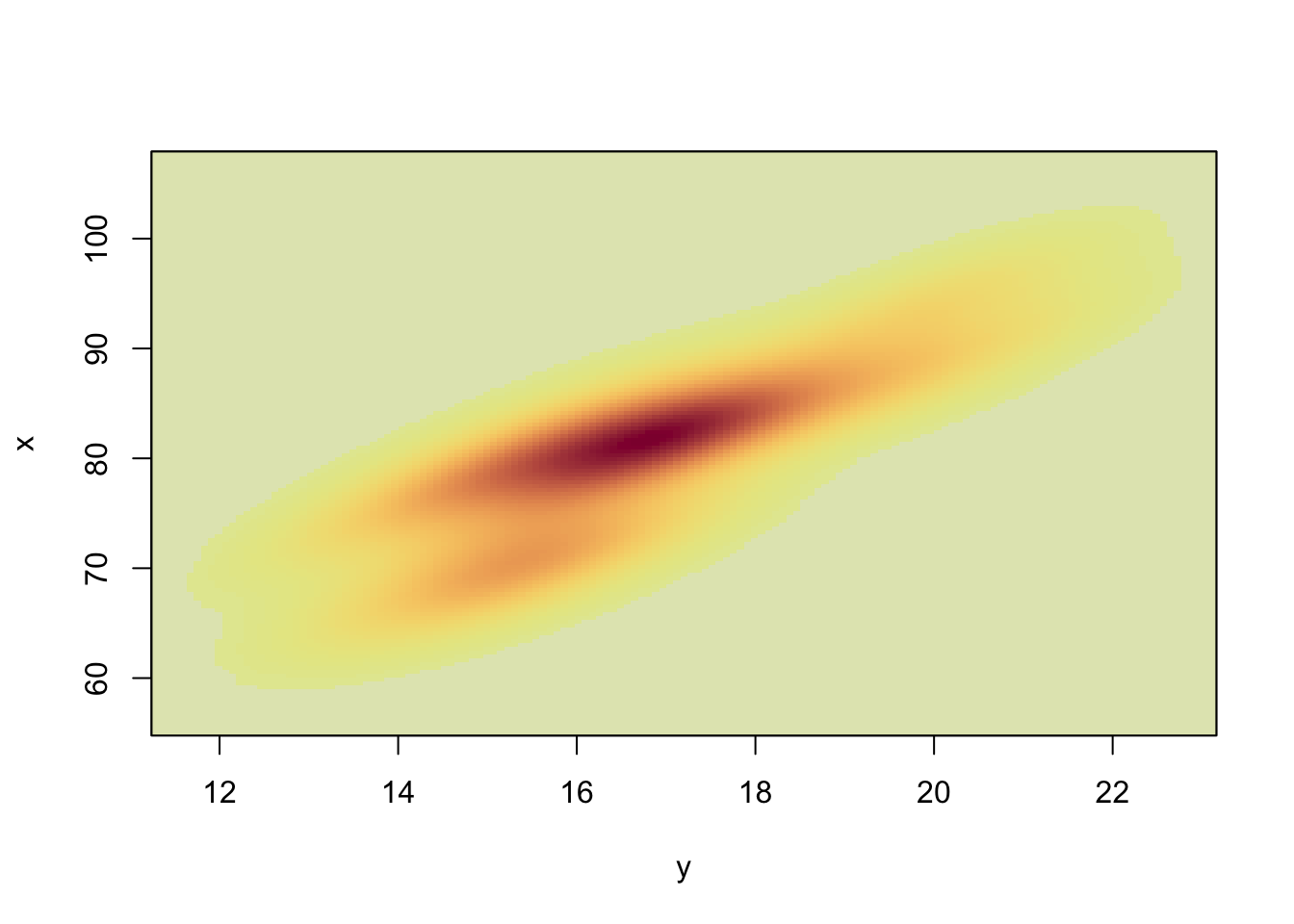
The Bivariate Kernel Density Plot is an alternative for the Scatter Plot. It is obtained by applying Kernel Density Estimation for a bivariate data set (\(x, y\)) and drawing contours of equal density on top of the Scatter Plot.
81.1.1 Horizontal axis
The horizontal axis represents the values for the \(x\) variable.
81.1.2 Vertical axis
The vertical axis represents the values for the \(y\) variable.
81.1.3 Third axis
The third axis represents the density of scatter points and is not drawn. Instead, the density is represented by contour lines which connect all points of equal density.
81.2 R Module
81.2.1 Public website
The Bivariate Kernel Density Plot can be found on the public website:
To compute the Bivariate Kernel Density Plot, the R code uses the kde function from the ks library.
81.3 Purpose
The Bivariate Kernel Density Plot is often used as an exploratory tool -- i.e. to visualize the relationship between two quantitative variables.
Compared with Chapter 70 and Chapter 80, this plot combines both ideas: it keeps the bivariate view of a scatterplot but adds density contours to reveal where points are concentrated.
81.4 Pros & Cons
81.4.1 Pros
The Bivariate Kernel Density Plot has the following advantages:
it is a much better tool than the Scatter Plot because it provides more information
it is easily understood by most readers
it allows the researcher to identify the shape of the relationship between both variables (e.g. linear versus non-linear)
81.4.2 Cons
The Bivariate Kernel Density Plot has the following disadvantages:
there are not many software packages which are able to compute the Bivariate Kernel Density Plot
it does not always display the true nature of the relationship between both variables
81.5 Example
A useful application is to inspect whether a visually linear cloud in a scatterplot is actually concentrated in one dense core or split into multiple dense regions. Multiple high-density regions may indicate subgroups, non-linearity, or outliers.
81.6 Task
Compare the bivariate density plot with the ordinary scatterplot for the same variables. Do both plots support the same interpretation?