• Descriptive
    • Moments
    • Concentration
    • Central Tendency
    • Variability
    • Stem-and-Leaf Plot
    • Histogram & Frequency Table
    • Data Quality Forensics
    • Conditional EDA
    • Quantiles
    • Kernel Density Estimation
    • Normal QQ Plot
    • Bootstrap Plot

    • Multivariate Descriptive Statistics
  • Distributions
    • Binomial Probabilities
    • Geometric Probabilities
    • Negative Binomial Probabilities
    • Hypergeometric Probabilities
    • Multinomial Probabilities
    • Dirichlet
    • Poisson Probabilities

    • Exponential
    • Gamma
    • Erlang
    • Weibull
    • Rayleigh
    • Maxwell-Boltzmann
    • Lognormal
    • Pareto
    • Inverse Gamma
    • Inverse Chi-Square

    • Beta
    • Power
    • Beta Prime (Inv. Beta)
    • Triangular

    • Normal (area)
    • Logistic
    • Laplace
    • Cauchy (standard)
    • Cauchy (location-scale)
    • Gumbel
    • Fréchet
    • Generalized Extreme Value

    • Normal RNG
    • ML Fitting
    • Tukey Lambda PPCC
    • Box-Cox Normality Plot
    • Noncentral t
    • Noncentral F
    • Sample Correlation r

    • Empirical Tests
  • Hypotheses
    • Theoretical Aspects of Hypothesis Testing
    • Bayesian Inference
    • Minimum Sample Size

    • Empirical Tests
    • Multivariate (pair-wise) Testing
  • Models
    • Manual Model Building
    • Guided Model Building
  • Time Series
    • Time Series Plot
    • Decomposition
    • Exponential Smoothing

    • Blocked Bootstrap Plot
    • Mean Plot
    • (P)ACF
    • VRM
    • Standard Deviation-Mean Plot
    • Spectral Analysis
    • ARIMA

    • Cross Correlation Function
    • Granger Causality
  1. Descriptive Statistics & Exploratory Data Analysis
  2. 55  Frequency Plot (Bar Plot)
  • Preface
  • Getting Started
    • 1  Introduction
    • 2  Why Do We Need Innovative Technology?
    • 3  Basic Definitions
    • 4  The Big Picture: Why We Analyze Data
  • Introduction to Probability
    • 5  Definitions of Probability
    • 6  Jeffreys’ axiom system
    • 7  Bayes’ Theorem
    • 8  Sensitivity and Specificity
    • 9  Naive Bayes Classifier
    • 10  Law of Large Numbers

    • 11  Problems
  • Probability Distributions
    • 12  Bernoulli Distribution
    • 13  Binomial Distribution
    • 14  Geometric Distribution
    • 15  Negative Binomial Distribution
    • 16  Hypergeometric Distribution
    • 17  Multinomial Distribution
    • 18  Poisson Distribution

    • 19  Uniform Distribution (Rectangular Distribution)
    • 20  Normal Distribution (Gaussian Distribution)
    • 21  Gaussian Naive Bayes Classifier
    • 22  Chi Distribution
    • 23  Chi-squared Distribution (1 parameter)
    • 24  Chi-squared Distribution (2 parameters)
    • 25  Student t-Distribution
    • 26  Fisher F-Distribution
    • 27  Exponential Distribution
    • 28  Lognormal Distribution
    • 29  Gamma Distribution
    • 30  Beta Distribution
    • 31  Weibull Distribution
    • 32  Pareto Distribution
    • 33  Inverse Gamma Distribution
    • 34  Rayleigh Distribution
    • 35  Erlang Distribution
    • 36  Logistic Distribution
    • 37  Laplace Distribution
    • 38  Gumbel Distribution
    • 39  Cauchy Distribution
    • 40  Triangular Distribution
    • 41  Power Distribution
    • 42  Beta Prime Distribution
    • 43  Sample Correlation Distribution
    • 44  Dirichlet Distribution
    • 45  Generalized Extreme Value (GEV) Distribution
    • 46  Frechet Distribution
    • 47  Noncentral t Distribution
    • 48  Noncentral F Distribution
    • 49  Inverse Chi-Squared Distribution
    • 50  Maxwell-Boltzmann Distribution
    • 51  Distribution Relationship Map

    • 52  Problems
  • Descriptive Statistics & Exploratory Data Analysis
    • 53  Types of Data
    • 54  Datasheets

    • 55  Frequency Plot (Bar Plot)
    • 56  Frequency Table
    • 57  Contingency Table
    • 58  Binomial Classification Metrics
    • 59  Confusion Matrix
    • 60  ROC Analysis

    • 61  Stem-and-Leaf Plot
    • 62  Histogram
    • 63  Data Quality Forensics
    • 64  Quantiles
    • 65  Central Tendency
    • 66  Variability
    • 67  Skewness & Kurtosis
    • 68  Concentration
    • 69  Notched Boxplot
    • 70  Scatterplot
    • 71  Pearson Correlation
    • 72  Rank Correlation
    • 73  Partial Pearson Correlation
    • 74  Simple Linear Regression
    • 75  Moments
    • 76  Quantile-Quantile Plot (QQ Plot)
    • 77  Normal Probability Plot
    • 78  Probability Plot Correlation Coefficient Plot (PPCC Plot)
    • 79  Box-Cox Normality Plot
    • 80  Kernel Density Estimation
    • 81  Bivariate Kernel Density Plot
    • 82  Conditional EDA: Panel Diagnostics
    • 83  Bootstrap Plot (Central Tendency)
    • 84  Survey Scores Rank Order Comparison
    • 85  Cronbach Alpha

    • 86  Equi-distant Time Series
    • 87  Time Series Plot (Run Sequence Plot)
    • 88  Mean Plot
    • 89  Blocked Bootstrap Plot (Central Tendency)
    • 90  Standard Deviation-Mean Plot
    • 91  Variance Reduction Matrix
    • 92  (Partial) Autocorrelation Function
    • 93  Periodogram & Cumulative Periodogram

    • 94  Problems
  • Hypothesis Testing
    • 95  Normal Distributions revisited
    • 96  The Population
    • 97  The Sample
    • 98  The One-Sided Hypothesis Test
    • 99  The Two-Sided Hypothesis Test
    • 100  When to use a one-sided or two-sided test?
    • 101  What if \(\sigma\) is unknown?
    • 102  The Central Limit Theorem (revisited)
    • 103  Statistical Test of the Population Mean with known Variance
    • 104  Statistical Test of the Population Mean with unknown Variance
    • 105  Statistical Test of the Variance
    • 106  Statistical Test of the Population Proportion
    • 107  Statistical Test of the Standard Deviation \(\sigma\)
    • 108  Statistical Test of the difference between Means -- Independent/Unpaired Samples
    • 109  Statistical Test of the difference between Means -- Dependent/Paired Samples
    • 110  Statistical Test of the difference between Variances -- Independent/Unpaired Samples

    • 111  Hypothesis Testing for Research Purposes
    • 112  Decision Thresholds, Alpha, and Confidence Levels
    • 113  Bayesian Inference for Decision-Making
    • 114  One Sample t-Test
    • 115  Skewness & Kurtosis Tests
    • 116  Paired Two Sample t-Test
    • 117  Wilcoxon Signed-Rank Test
    • 118  Unpaired Two Sample t-Test
    • 119  Unpaired Two Sample Welch Test
    • 120  Two One-Sided Tests (TOST) for Equivalence
    • 121  Mann-Whitney U test (Wilcoxon Rank-Sum Test)
    • 122  Bayesian Two Sample Test
    • 123  Median Test based on Notched Boxplots
    • 124  Chi-Squared Tests for Count Data
    • 125  Kolmogorov-Smirnov Test
    • 126  One Way Analysis of Variance (1-way ANOVA)
    • 127  Kruskal-Wallis Test
    • 128  Two Way Analysis of Variance (2-way ANOVA)
    • 129  Repeated Measures ANOVA
    • 130  Friedman Test
    • 131  Testing Correlations
    • 132  A Note on Causality

    • 133  Problems
  • Regression Models
    • 134  Simple Linear Regression Model (SLRM)
    • 135  Multiple Linear Regression Model (MLRM)
    • 136  Logistic Regression
    • 137  Generalized Linear Models
    • 138  Multinomial and Ordinal Logistic Regression
    • 139  Cox Proportional Hazards Regression
    • 140  Conditional Inference Trees
    • 141  Leaf Diagnostics for Conditional Inference Trees
    • 142  Conditional Random Forests
    • 143  Hypothesis Testing with Linear Regression Models (from a Practical Point of View)

    • 144  Problems
  • Introduction to Time Series Analysis
    • 145  Case: the Market of Health and Personal Care Products
    • 146  Decomposition of Time Series
    • 147  Ad hoc Forecasting of Time Series
  • Box-Jenkins Analysis
    • 148  Introduction to Box-Jenkins Analysis
    • 149  Theoretical Concepts
    • 150  Stationarity
    • 151  Identifying ARMA parameters
    • 152  Estimating ARMA Parameters and Residual Diagnostics
    • 153  Forecasting with ARIMA models
    • 154  Intervention Analysis
    • 155  Cross-Correlation Function
    • 156  Transfer Function Noise Models
    • 157  General-to-Specific Modeling
  • Model Building Strategies
    • 158  Introduction to Model Building Strategies
    • 159  Manual Model Building
    • 160  Model Validation
    • 161  Regularization Methods
    • 162  Hyperparameter Optimization Strategies
    • 163  Guided Model Building in Practice
    • 164  Diagnostics, Revision, and Guided Forecasting
    • 165  Leakage, Target Encoding, and Robust Regression
  • References
  • Appendices
    • Appendices
    • A  Method Selection Guide
    • B  Presentations and Teaching Materials
    • C  R Language Concepts for Statistical Computing
    • D  Matrix Algebra
    • E  Standard Normal Table (Gaussian Table)
    • F  Critical values of Student’s \(t\) distribution with \(\nu\) degrees of freedom
    • G  Upper-tail critical values of the \(\chi^2\)-distribution with \(\nu\) degrees of freedom
    • H  Lower-tail critical values of the \(\chi^2\)-distribution with \(\nu\) degrees of freedom

Table of contents

  • 55.1 Definition
  • 55.2 Horizontal axis
  • 55.3 Vertical axis
  • 55.4 R Module
  • 55.5 Purpose
  • 55.6 Pros & Cons
    • 55.6.1 Pros
    • 55.6.2 Cons
  • 55.7 Example
  • 55.8 Task
  1. Descriptive Statistics & Exploratory Data Analysis
  2. 55  Frequency Plot (Bar Plot)

55  Frequency Plot (Bar Plot)

55.1 Definition

The Frequency Plot displays the absolute frequencies or counts for different items or categories. This plot is used with qualitative data - in case of quantitative data one should use the histogram instead (cf. Chapter 62). Even though it is not required, we display the absolute frequencies in sorted order -- this allows the user to easily see the ranking of each category.

55.2 Horizontal axis

The horizontal axis displays the categories of the variable under investigation. If there is sufficient space, the labels of each category are printed along the axis. The categories are ordered according to their absolute frequencies (from high to low). The width of the bars that are displayed have no meaning.

55.3 Vertical axis

The counts (i.e. absolute frequencies) of each category are represented by the vertical axis. The height of the bars that are displayed correspond to the absolute frequencies on the vertical axis.

55.4 R Module

The Frequency Plot can be found on the public website:

  • https://compute.wessa.net/histo.wasp

Note: Frequency Plots and Histograms are generated by the same R Module (even though both methods do not have the same interpretation). The R Module automatically detects whether the data are qualitative or quantitative (the appropriate method is selected by the software).

The Frequency plot is available in RFC under the menu “Descriptive / Histogram & Frequency Table”.

If you prefer to compute the Frequency Plot on your local computer, the following code snippet can be used in the R console:

Code
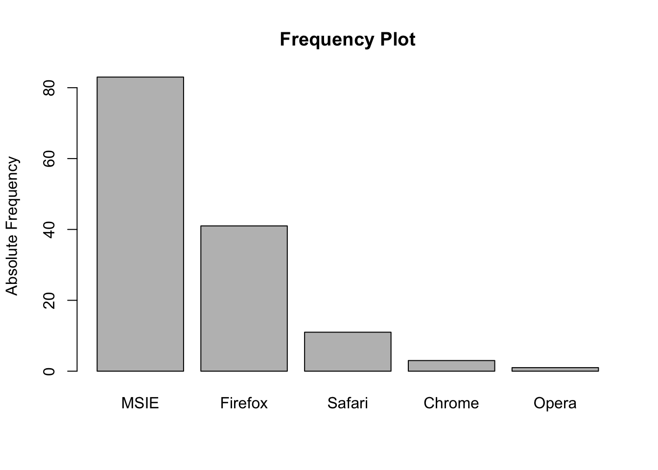
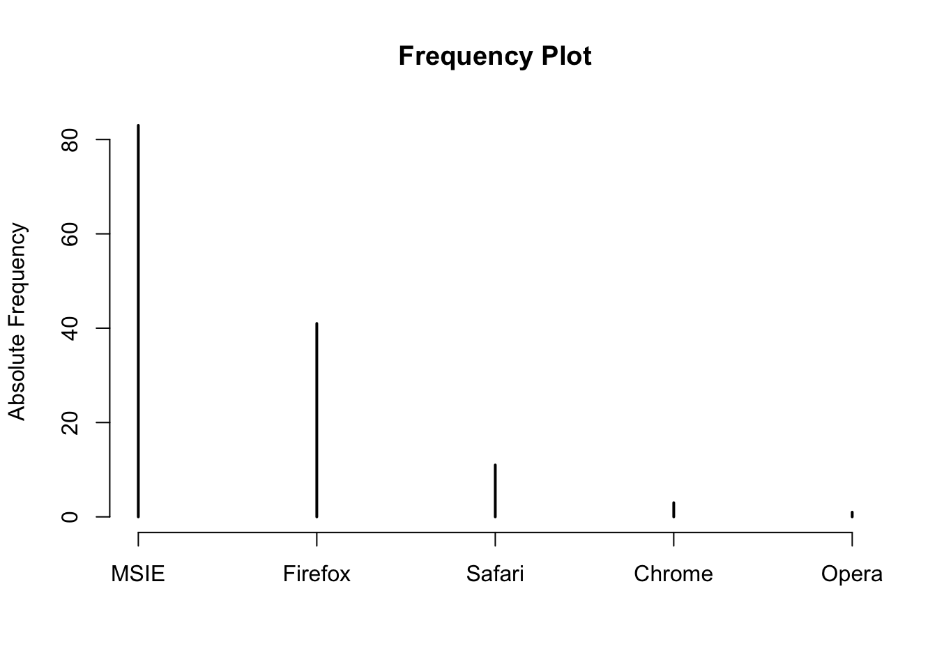
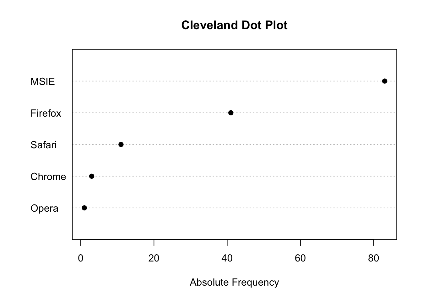
x <- c('Firefox','MSIE','MSIE','MSIE','MSIE','Firefox','Firefox','MSIE','Chrome','Firefox','Firefox','MSIE','MSIE','MSIE','MSIE','MSIE','Firefox','MSIE','Firefox','Firefox','MSIE','Firefox','Firefox','MSIE','MSIE','Firefox','Firefox','Safari','MSIE','Firefox','MSIE','MSIE','MSIE','Firefox','MSIE','MSIE','Firefox','MSIE','MSIE','MSIE','Firefox','MSIE','MSIE','Firefox','Opera','Firefox','MSIE','MSIE','MSIE','Firefox','Firefox','Safari','Firefox','Firefox','MSIE','MSIE','MSIE','Firefox','Safari','MSIE','MSIE','MSIE','MSIE','Firefox','MSIE','Chrome','MSIE','Firefox','Safari','Safari','Firefox','MSIE','MSIE','Firefox','MSIE','MSIE','MSIE','MSIE','Firefox','MSIE','MSIE','MSIE','MSIE','Firefox','MSIE','Firefox','Safari','Firefox','MSIE','MSIE','MSIE','MSIE','MSIE','MSIE','MSIE','Safari','Firefox','MSIE','Firefox','MSIE','MSIE','MSIE','MSIE','MSIE','Firefox','MSIE','Firefox','MSIE','MSIE','MSIE','Firefox','MSIE','MSIE','MSIE','Safari','MSIE','Firefox','Firefox','MSIE','Safari','Safari','Firefox','MSIE','MSIE','MSIE','MSIE','Chrome','MSIE','Firefox','MSIE','MSIE','MSIE','MSIE','Firefox','Safari','MSIE','MSIE','MSIE','MSIE')
par2 = 'grey'
mytab <- sort(table(x),T)
barplot(mytab, col = par2, main = "Frequency Plot", xlab = "", ylab = 'Absolute Frequency')
Figure 55.1: Frequency Plot (based on barplot)

The above code snippet produces the ordinary Frequency Plot based on the barplot function in R (only the height of each bar is meaningful). There are other alternatives based on the (ordinary) plot and dotchart functions. The dot chart variant is sometimes called the Cleveland dot plot (Cleveland and McGill 1985).

Code
plot(mytab, ylab = "Absolute Frequency", main = "Frequency Plot", xlab = "")
Figure 55.2: Frequency Plot (based on plot)
Code
taborder <- mytab[order(mytab)]
dotchart(taborder, pch=19, main="Cleveland Dot Plot", xlab="Absolute Frequency", ylab="")
Figure 55.3: Frequency Plot (based on dotchart)

To create a Frequency Plot, the R code first computes a frequency table with the table() function (there is no external library required). The result of this function is used as an input in barplot, plot, or dotchart which renders the plot on screen. The sort function is optional and can be used to order the bars in ascending or descending order. The dataset represents the various browsers that were used by students in 2010 while doing online assignments. At the time, most students used Internet Explorer followed by FireFox, Safari, and Chrome.

55.5 Purpose

The Frequency Plot can be used to graphically examine how often each category occurs in the univariate dataset. The absolute frequencies are ordered from high to low because this allows the user to quickly assess the ranking of each category.

55.6 Pros & Cons

55.6.1 Pros

The Frequency Plot has the following advantages:

  • It is easy to compute.
  • It is relatively easy to interpret.
  • Many readers are familiar with Frequency Plots.

55.6.2 Cons

The Frequency Plot has the following disadvantages:

  • The amount of information that is conveyed is limited.

  • If there are many categories (with relatively low frequencies) the Frequency Plot may be hard to read. Excluding the categories with extremely low frequencies may be necessary to solve this problem.

55.7 Example

The following example shows the status of checking accounts from clients of a local credit company. Note that the categories include both balance ranges (“Negative”, “0 - 200”, “Over 200”) and a fundamentally different category (“No checking account”) representing the absence of an account. This mixture is common in real-world data and illustrates why frequency plots are appropriate: the data is categorical regardless of whether some categories happen to describe numerical ranges.

The interactive R module uses the plot and dotchart functions whereas the old module (which is available on https://compute.wessa.net/histo.wasp) relies on barplot.

Interactive Shiny app (click to load).
Open in new tab

55.8 Task

Compute the Frequency Plot for all operating systems and explain your findings. Describe the format that is used in RFC to generate this plot (for quantitative data). Hint: Chapter 54 explains where the data can be found.

Cleveland, William S., and Robert McGill. 1985. “Graphical Perception and Graphical Methods for Analyzing Scientific Data.” Science 229 (4716): 828–33. https://doi.org/10.1126/science.229.4716.828.
56  Frequency Table

© 2026 Patrick Wessa. Provided as-is, without warranty.

Feedback: e-mail | Anonymous contributions: click to copy (Sats) | click to copy (XMR)

Cookie Preferences