The Mean Plot visualizes the Arithmetic Mean for sequential and periodic subseries (groups of data). The Mean Plot analysis consists of 6 charts:
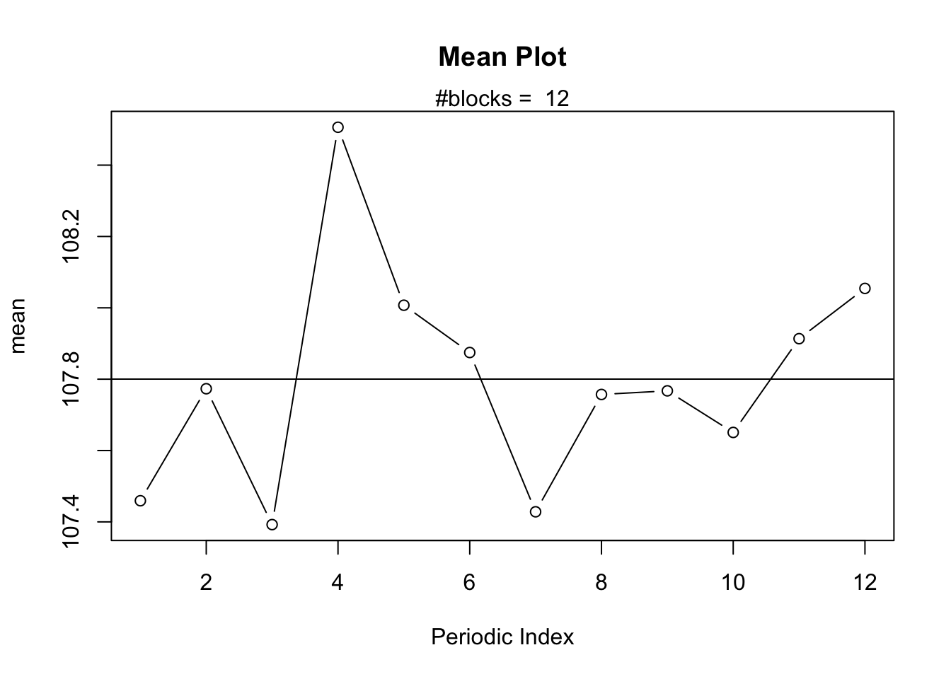
The actual Mean Plot which displays the Arithmetic Mean against the Periodic Index for a pre-specified blockwidth parameter.
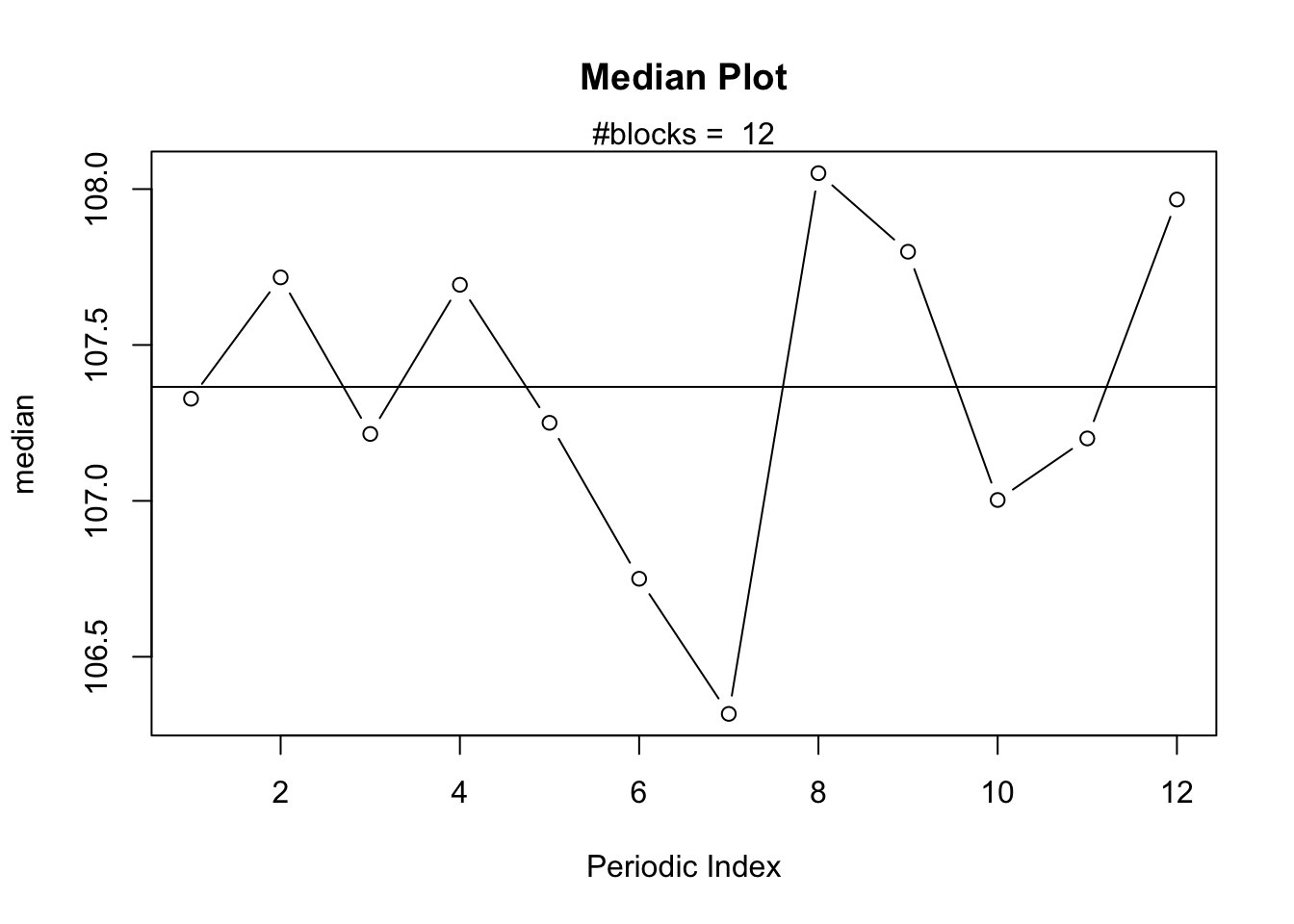
The Median Plot which displays the Median against the Periodic Index.
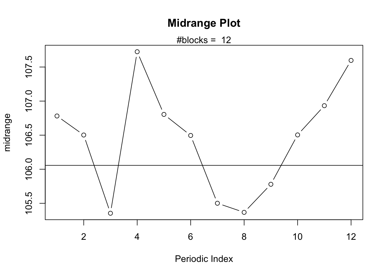
The Midrange Plot which displays the Midrange against the Periodic Index.
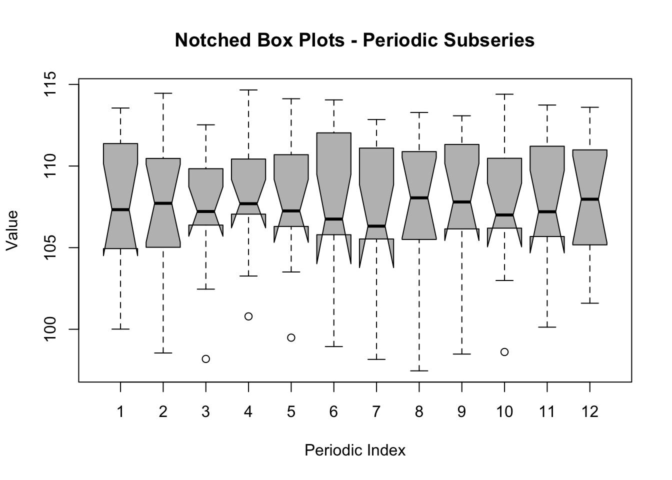
The Notched Boxplots for periodic subseries shows the same information as the Median Plot but with added Boxplots.
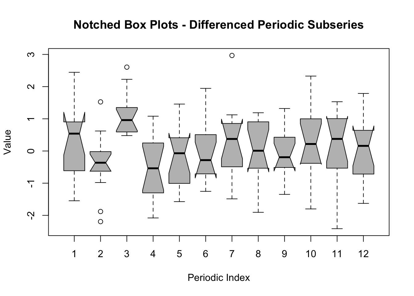
The Notched Boxplots for differenced periodic subseries is the same as the previous plot but the data have been transformed first: instead of using the original time series \(Y_t\) we use \(Y_t - Y_{t-1}\).
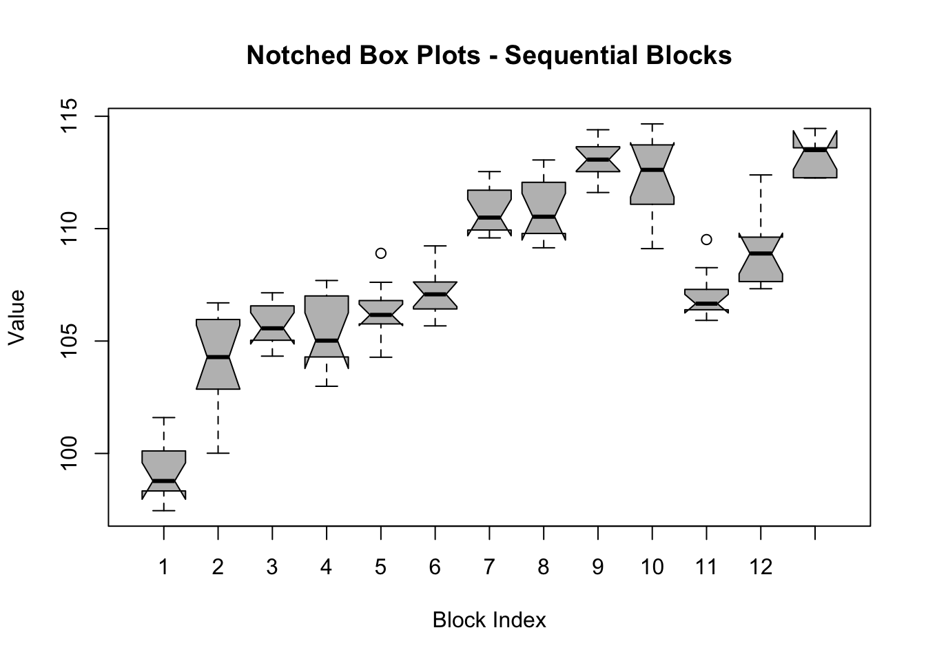
The Notched Boxplots for sequential subseries simply computes Notched Boxplots for groups of data which are placed in chronological order. The first Boxplot corresponds to the first “blockwidth” number of observations. The second Boxplot is based on the next “blockwidth” number of observations, and so on.
The blockwidth parameter is usually chosen equal to the seasonal period (i.e. 12 for monthly time series, 4 for quarterly time series, etc.). The periodic index indicates the number of the periodic subseries. If the blockwidth is chosen equal to 12 (assuming we are investigating a monthly time series for which the first observation is a January) then the periodic subseries of index 1 corresponds to all the observations in January. Likewise, the periodic subseries of index 2 corresponds to all observations of the month February, etc.
88.1.1 Horizontal axis
The horizontal axis represents the periodic index (charts 1-5), or sequential index (chart 6).
88.1.2 Vertical axis
The vertical axis shows the value of the time series for which Central Tendency measures are computed.
z <-data.frame(t(arr))names(z) <-c(1:par1)boxplot(z,notch=TRUE,col='grey',xlab='Periodic Index',ylab='Value',main='Notched Box Plots - Periodic Subseries')
Warning in (function (z, notch = FALSE, width = NULL, varwidth = FALSE, : some
notches went outside hinges ('box'): maybe set notch=FALSE
z <-data.frame(t(darr))names(z) <-c(1:par1)boxplot(z,notch=TRUE,col='grey',xlab='Periodic Index',ylab='Value',main='Notched Box Plots - Differenced Periodic Subseries')
Warning in (function (z, notch = FALSE, width = NULL, varwidth = FALSE, : some
notches went outside hinges ('box'): maybe set notch=FALSE
z <-data.frame(arr)names(z) <-c(1:np)boxplot(z,notch=TRUE,col='grey',xlab='Block Index',ylab='Value',main='Notched Box Plots - Sequential Blocks')
Warning in (function (z, notch = FALSE, width = NULL, varwidth = FALSE, : some
notches went outside hinges ('box'): maybe set notch=FALSE
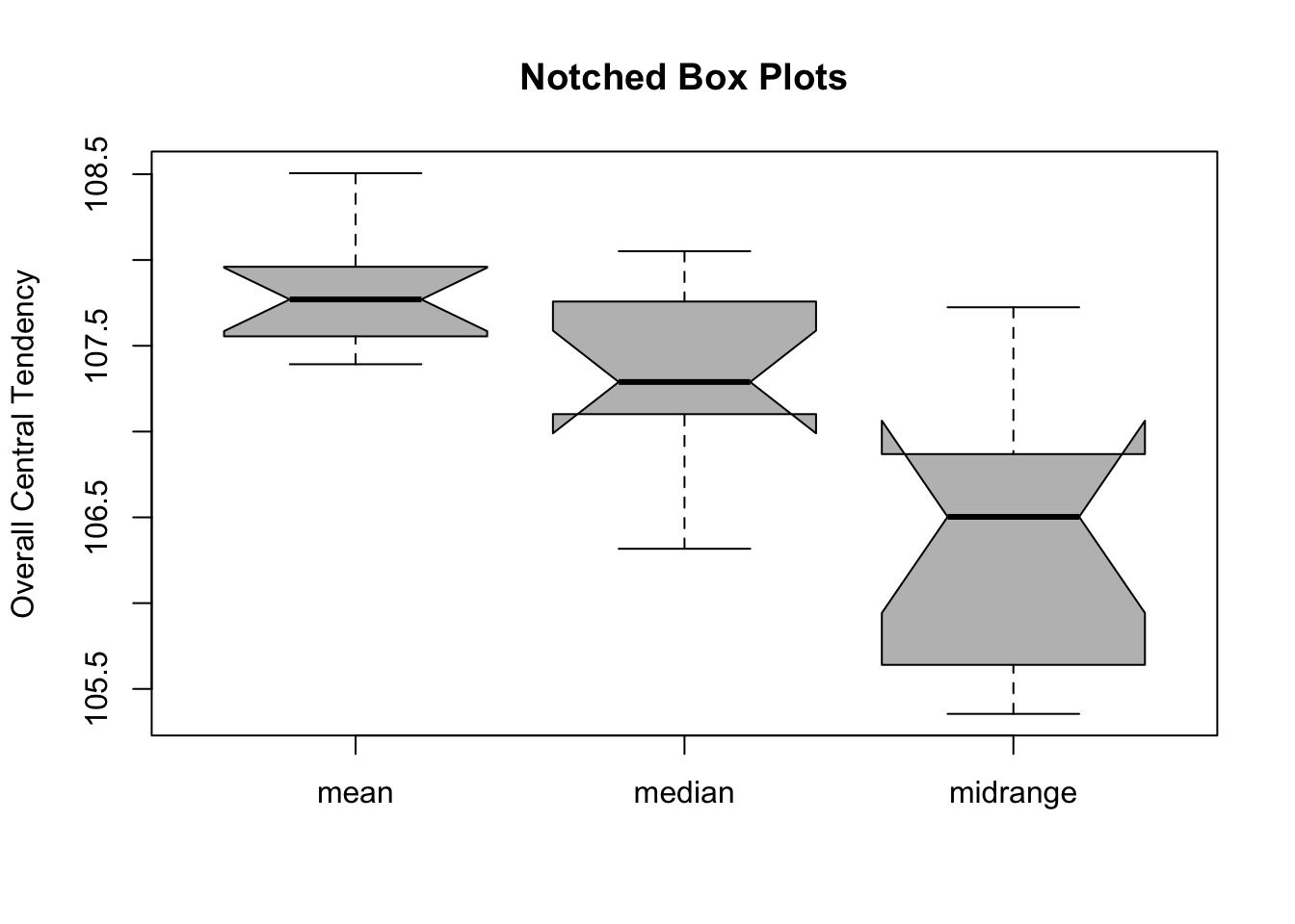
z <-data.frame(cbind(arr.mean,arr.median,arr.midrange))names(z) <-list('mean','median','midrange')boxplot(z,notch=TRUE,col='grey',ylab='Overall Central Tendency',main='Notched Box Plots')
Warning in (function (z, notch = FALSE, width = NULL, varwidth = FALSE, : some
notches went outside hinges ('box'): maybe set notch=FALSE
   Min. 1st Qu.  Median    Mean 3rd Qu.    Max.
  97.45  105.68  107.37  107.80  111.17  114.66
To compute the Mean Plot, the R code uses the following functions from the base R installation: plot, boxplot, mean, median, and quantile. The univariate time series is a simulated Random-Walk.
88.3 Purpose
The Mean Plot allows us to investigate whether or not the Arithmetic Mean varies between sequential or seasonal groups of data. This provides information about the presence of non-seasonal and seasonal trends in time series.
88.4 Pros & Cons
88.4.1 Pros
The Mean Plot has the following advantages:
It provides a lot of information about the structural properties of time series.
It is easy to interpret.
It can also be used to test whether the prediction errors of a forecasting model satisfy the underlying assumptions of the model.
88.4.2 Cons
The Mean Plot has the following disadvantages:
Most readers are not familiar with this type of analysis.
There are only few software packages which allow the Mean Plot to be computed.
88.5 Example
Consider the famous Airline time series which spans a period of 12 years -- hence, it has a total of \(T = 12*12 = 144\) observations. The Mean Plot in the following analysis shows 12 points, one for each month. Since the time series starts in January, the first point on the chart represents the Arithmetic Mean of all observations in January (since there are exactly 12 years, this mean is computed as \(M_i = \frac{1}{12} \sum_{j=1}^{12} Y_{12 \times (j-1) + i}\) for periodic index \(i = 1, 2, …, 12\)). It can be observed that the number of passengers is higher than the overall average (of about 280) during the summer (\(i = 6, 7, 8, 9\)) while the other months fall below the overall average.
The Median Plot displays the median for each periodic index (i.e. month) instead of the Arithmetic Mean. The shape of the Median Plot is the same as that of the Mean Plot which is typically the case for time series with strong seasonality.
The Midrange Plot uses the midrange for each periodic index instead of the Median or Arithmetic Mean. Again, the shape is very similar to the previous plots which strengthens our confidence that there is a typical seasonal pattern in the data.
Let us test the hypothesis that the time series exhibits a seasonal pattern based on the notches that are displayed in the plot and which can be interpreted as the confidence intervals for the median. The horizontal bars in the middle of each boxplot represents the Median of the corresponding periodic index (month). The summer period exhibits higher Median values than the remainder of the year. On the other hand, however, the notches for each of these Medians are overlapping which implies that the differences can be attributed to chance.
The observation that the Medians of different months are not different (but equal) comes as a surprise and does not correspond to what we see in Section 87.5. The Time Plot clearly shows a regular seasonal pattern which is repeated in every year. So which conclusion is correct?
The Boxplots of the Differenced Periodic Subseries allows us to explain this contradiction and answer the question unambiguously. When we compute the Notched Box Plots for the differenced time series (i.e. \(Y_t - Y_{t-1}\) instead of \(Y_t\)) then the long-run trend is removed from the series. As a consequence, the seasonal pattern is no longer obfuscated by the presence of a non-seasonal trend, which is exactly why the Differenced Periodic Subseries shows a much clearer picture of the underlying seasonality (observe how most of the Medians have notches that do no longer overlap each other).
Note that when a time series is differenced, the first observation is lost because \(Y_t - Y_{t-1}\) can only be computed for \(t = 2, 3, …, T\). Hence, the first observation of the Airline time series, after differencing, is now the month of February. The interpretation of the periodic index in the differenced and non-differenced plot is, therefore, different!
The first conclusion is that the time series under investigation does, indeed, exhibit a strong seasonal pattern. The second conclusion is that the rate of change in periodic index \(i = 2, 5, 6, and 11\) (i.e. months 3, 6, 7, and 12) are systematically positive. On the other hand, in months 9, 10, and 11 the rate of change is systematically negative.
From the Notched Box Plots of sequential years (we used a blockwidth parameter = 12) it can be concluded that the long-run trend is very strong, causing the Medians of successive years to increase. Also observe how the notches of Medians which are two or three years apart, do not overlap. The conclusion is that the time series under investigation exhibits a non-seasonal (i.e. long-run) trend.
88.6 Task
Compute the Mean Plot for the monthly Marriages time series and describe your conclusions.