Before using a guided workflow that automates audit, strategy, and validation, it is useful to work through a classification problem manually. In this chapter you will use the app available in the menu Models / Manual Model Building to fit individual models, compare their confusion matrices, and observe how the training percentage and row ordering affect the results.
159.1 The Manual Model Building App
The app available in the menu Models / Manual Model Building provides a direct interface for fitting and comparing classifiers. Its layout contains the following components:
Component
Purpose
Bayes tab
fit a Gaussian Naive Bayes classifier and inspect its confusion matrix
GLM tab
fit an ordinary logistic regression model or a regularized glmnet classifier and inspect its confusion matrix
Tree tab
fit either a conditional inference tree or a conditional random forest and inspect its confusion matrix
ROC tab
overlay ROC curves for the fitted classifiers on the same plot
Regression tab
fit an ordinary or regularized linear regression model with diagnostics for continuous outcomes
Training % slider
control the share of data used for training (the rest is held out for testing)
Shuffle
switch between keeping the original row order and shuffling before splitting
Laplace
set the Laplace smoothing parameter for the Naive Bayes classifier
The app fits each model on the training rows and evaluates it on the held-out rows. This is a single holdout split — the simplest form of validation, discussed in detail in Chapter 160.
In this chapter the scope remains classification, so the discussion will concentrate on the Bayes, GLM, Tree, and ROC tabs. The Regression tab is still useful to explore later when the outcome is continuous, but it is not needed for the Pima example.
The dataset used in this chapter is Pima.tr from the MASS package — a cleaned teaching subset of 200 female patients of Pima Indian heritage with no missing values. The full research dataset (PimaIndiansDiabetes2 from mlbench) contains additional observations and missing entries that require imputation before modeling. This chapter uses the clean subset so that the focus stays on the model building workflow rather than on data cleaning. The guided workflow in Section 163.5 also uses Pima.tr, so the manual and guided results can be compared directly.
diabetes_share <-round(prop.table(table(Pima.tr$type)), 3)knitr::kable(data.frame(class =names(diabetes_share), share =as.numeric(diabetes_share)),caption ="Outcome shares in Pima.tr")
Outcome shares in Pima.tr
class
share
No
0.66
Yes
0.34
The outcome is unbalanced: roughly two thirds of the patients do not have diabetes. This matters for classification because a model that always predicts the majority class would already achieve about 66% accuracy without learning anything from the predictors.
159.3 Fitting a Naive Bayes Classifier
The Bayes tab in the app fits a Gaussian Naive Bayes classifier (see Chapter 21 for the full treatment). The model assumes that each predictor follows a normal distribution within each class and uses Bayes’ theorem to compute the posterior probability of each class for a new observation.
The output shows:
the prior probabilities for each class (based on the training data),
the class-conditional means and standard deviations for each predictor,
a confusion matrix on the held-out rows.
The confusion matrix (see Chapter 59) is the primary evaluation tool here. It shows how many held-out observations were correctly classified and how many were misclassified. From the confusion matrix you can read off the sensitivity and specificity (see Chapter 8): sensitivity measures how well the model detects positive cases (diabetes present), and specificity measures how well it identifies negative cases (diabetes absent).
159.4 Comparing with Logistic Regression
The GLM tab fits a logistic regression model (see Chapter 136) on the same training data with the same predictors. Logistic regression does not assume normally distributed predictors. Instead, it models the log-odds of the target as a linear function of the predictors.
Compare the confusion matrix from the GLM tab with the one from the Bayes tab. The two models may agree on most cases but differ on borderline observations. The confusion matrix lets you see exactly where they disagree: does one model miss more positive cases (lower sensitivity) while the other produces more false positives (lower specificity)?
The same tab now also exposes ridge, lasso, elastic net, and an automatic penalty-family search through glmnet (see Chapter 161). When you switch on regularization, the app does not silently refit in the background during every UI change. You explicitly launch the search with Fit regularized GLM, the fit runs asynchronously, and the app shows a progress/wait message if another heavy search is already using the compute slot.
159.5 Comparing with a Conditional Inference Tree
The Tree tab fits a conditional inference tree by default (see Chapter 140). Unlike the two previous models, the tree does not produce coefficients. It partitions the data into groups using a sequence of binary splits and assigns the majority class in each terminal node.
The tree has two distinctive properties:
it is directly interpretable as a decision diagram,
it automatically selects predictors and split points using permutation tests.
Compare its confusion matrix with the earlier two. A tree may produce higher specificity but lower sensitivity (or the reverse) depending on where the splits fall. The question is not which model is universally best but which model produces the most useful trade-off for the problem at hand.
The same Tree tab also includes a selector for cforest (see Chapter 142). That option replaces one interpretable tree by an ensemble of many trees. The forest is usually harder to explain as a single diagram, but it can produce better predictive performance. The app therefore lets you compare ctree and cforest directly inside the same tab before you move to the ROC comparison.
For binary targets, both the GLM tab and the Tree tab expose a threshold slider. The fitted model first produces a probability for the positive class; the threshold then converts that probability into a final yes/no classification. Lowering the threshold makes positive predictions easier to trigger, which typically increases sensitivity but may reduce specificity and precision.
159.6 Model Comparison with ROC Curves
The ROC tab overlays the ROC curves of the fitted classifiers on the same plot (see Chapter 60 for the full treatment of ROC analysis). The ROC curve traces sensitivity against the false positive rate as the classification threshold varies from 0 to 1.
The area under the ROC curve (AUC) summarizes discrimination: an AUC of 0.5 means the model is no better than random guessing, and an AUC of 1.0 means perfect separation. The ROC tab reports the AUC for each model, so you can compare their discriminative ability directly.
This comparison is more informative than comparing confusion matrices at a single threshold because the ROC curve shows how each model behaves across all possible thresholds.
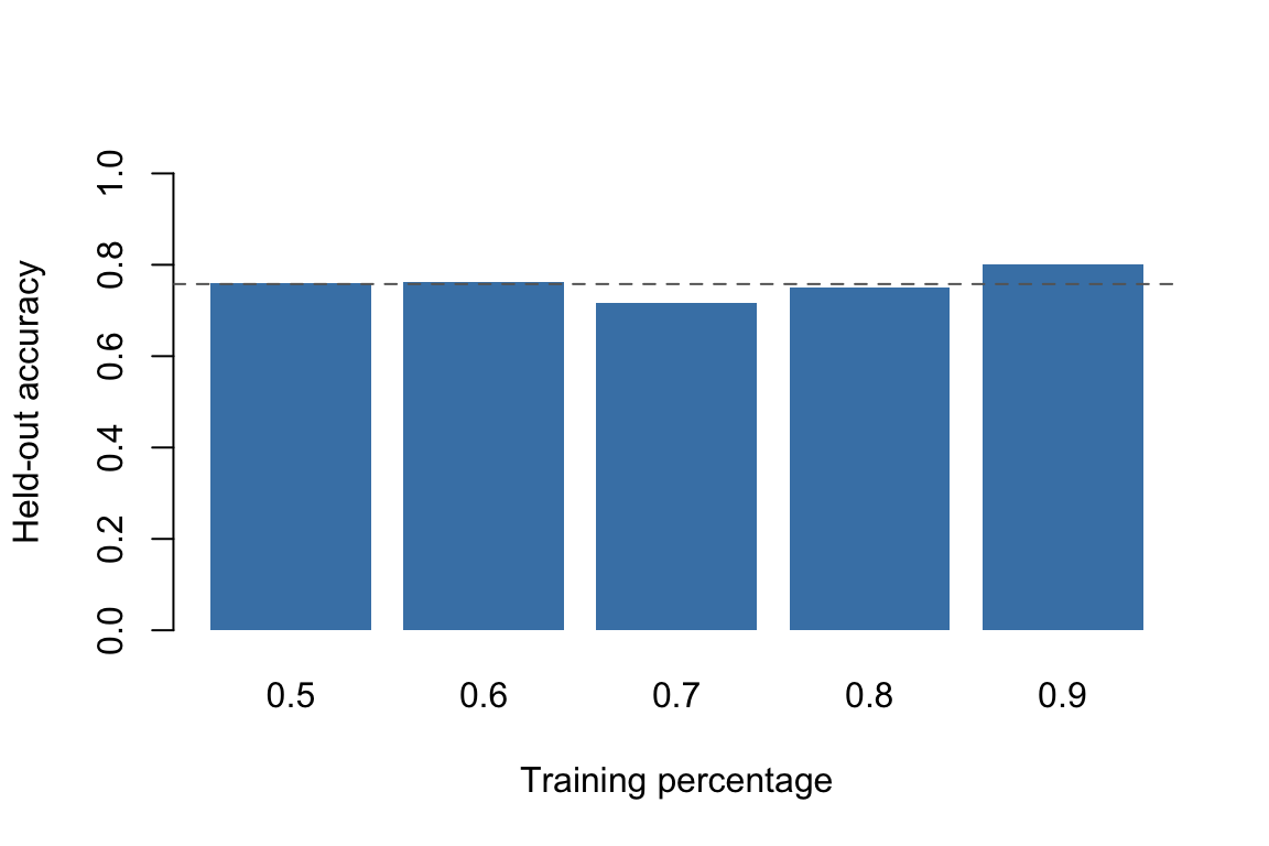
159.7 The Effect of Training Percentage
The training percentage slider controls how much of the data is used for fitting and how much is held out for evaluation. Moving the slider from 0.6 to 0.95 changes the balance between two competing concerns:
more training data generally produces a better-fitted model,
less held-out data produces a noisier estimate of held-out performance.
Naive Bayes accuracy at different training percentages on Pima.tr
Each bar represents a single random split. If you run this code again with a different seed, the bars will change — sometimes substantially. That instability is exactly the problem that repeated holdout (Section 160.3) is designed to address.
159.8 The Effect of Shuffling
The shuffle option in the app controls whether the rows are randomized before the training/test split is made. If the data happen to be sorted by the target variable (or by any variable correlated with the target), a non-shuffled split can assign most of one class to training and most of the other class to testing. The result is a split that does not represent the population.
sorted_pima <- Pima.tr[order(Pima.tr$type), ]n <-nrow(sorted_pima)idx_no_shuffle <-seq_len(floor(0.8* n))cat("Class distribution in test set without shuffling:\n")
set.seed(99)idx_shuffled <-sample(seq_len(n), size =floor(0.8* n))cat("\nClass distribution in test set with shuffling:\n")
Class distribution in test set with shuffling:
print(table(sorted_pima[-idx_shuffled, "type"]))
 No Yes
 23  17
The non-shuffled split assigns almost all positive cases to the test set (because they were sorted to the end). The shuffled split preserves the original class balance approximately. Stratified holdout (Section 160.4) goes one step further: it guarantees that the class proportions in training and test are as close to the population proportions as possible.
This is also one of the important differences between the manual and guided workflows. The manual app uses a simple sequential split unless you turn on shuffling yourself. The guided app, by contrast, automatically uses shuffled repeated holdout for tabular regression and stratified shuffled repeated holdout for tabular classification. So if you compare the same dataset across the two apps, different validation results can arise simply because the splitting discipline is stronger in the guided workflow.
159.9 Practical Exercises
Open the app with the Pima dataset and remove glu (glucose) from the predictor set. How does the confusion matrix change for each of the three models? Which model is most affected by losing that predictor?
Set the training percentage to 0.6 and record the accuracy for all three models. Then set it to 0.9 and record the accuracy again. Does the ranking of models change?
Compare the ROC curves at 0.7 and 0.9 training percentage. Which model shows the most stable AUC?
Using the confusion matrix from the Bayes tab, compute the sensitivity and specificity by hand and verify that your values match the app output.
After completing this chapter, open the guided Pima session in Section 163.5 and compare the models available there with the three models you used here. What does the guided workflow add that the manual workflow does not provide?