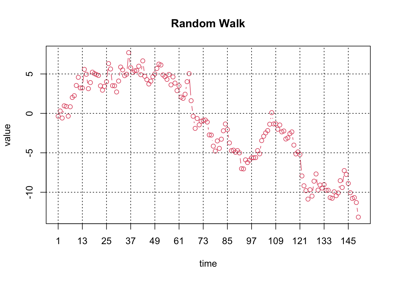
The Time Series Plot for a time series \(Y_t\) for \(t=1, 2, …, T\) with \(T\) observations is simply a Scatter Plot for the data pairs \((Y_t, t)\), i.e. the observations are plotted against the time index \(t\).
87.1.1 Horizontal axis
The horizontal axis represents the time index \(t\).
87.1.2 Vertical axis
The vertical axis shows the values of \(Y_t\).
87.2 R Module
87.2.1 Public website
The Time Series Plot is available on the public website:
The Time Series Plot is also available in RFC (when using the default profile) under the “Time Series / Time Series Plot” menu item.
To compute the Time Series Plot on your local machine, the following script can be used in the R console:
x <-cumsum(rnorm(150))summary(x)par4 =12ylimmax =''ylimmin =''ylab ='value'xlab ='time'main ='Random Walk'n <-length(x)plot(x,col=2,type='b',main=main,xlab=xlab,ylab=ylab,xaxt='n')axis(1,at=seq(1,n,par4))grid(nx=0,ny=NULL,col='black')abline(v=seq(1,n,par4),col='black',lty='dotted')
   Min. 1st Qu.  Median    Mean 3rd Qu.    Max.
-13.151  -5.196  -1.332  -1.304   3.987   7.700
To compute the Time Series Plot, the R code uses the plot function from the base R installation.
87.3 Purpose
The Time Series Plot is used to visualise the time series under investigation. Experienced researchers will be able to identify important properties such as non-seasonal and seasonal trends.
87.4 Pros & Cons
87.4.1 Pros
The Time Series Plot has the following advantages:
It is easy to compute and interpret.
Most readers will be able to understand the plot.
87.4.2 Cons
The Time Series Plot has the following disadvantages:
In the presence of outliers, it is hard to identify the key properties of the data presented.
The plot shows the famous Airline time series which exhibits a non-seasonal and a seasonal trend. This time series is used in numerous examples throughout this book.