The Histogram is computed for quantitative data and involves the following steps:
the observations are sorted in ascending order
the observations are categorized into a number of “bins” (most histograms have bins of equal width)
for each bin, the number of observations is counted (absolute frequency)
the absolute frequencies are plotted as rectangular shapes for each bin -- the height of the rectangles corresponds to the absolute frequency of the corresponding bin (the width of the rectangles is equal to the width/range of the bins)
62.2 Horizontal axis
The variable under investigation is shown on the horizontal axis. This is always used for quantitative variables (either continuous or discrete).
62.3 Vertical axis
The absolute frequency (of each bin) is displayed on the vertical axis.
62.4 Rows of associated Frequency Table
The rows of the Frequency Table correspond to the bins that have been created to categorize the original observations. Each bin is written as an interval with a lower and upper bound. The bounds can be open-ended or closed: for instance, the bin [1000, 1500[ has an open-ended upper bound (i.e. the value 1500 is not included) and a closed lower bound (i.e. the value 1000 is included).
62.5 Column “Midpoint” of associated Frequency Table
The midpoint is simply the central value of the bin. One can think of the midpoint as the value by which each observation that falls inside the bin is replaced.
62.6 Column “Abs. Freq.” of associated Frequency Table
This column shows the Absolute Frequency (i.e. the count) or the number of observations that are contained in the bin.
62.7 Column “Rel. Freq.” of associated Frequency Table
This column shows the Relative Frequency which is defined as the Absolute Frequency divided by the total number of observations. In other words, the Relative Frequency is the (percentage) share of observations that fall inside the bin.
62.8 Column “Cumul. Rel. Freq.” of associated Frequency Table
The Cumulative Relative Frequency is based on the previous column (Relative Frequency) and represent the share (percentage) of observations that are smaller than the upper bound of the bin that is considered. For instance, the computation of Section 62.13 shows that the Cumulative Relative Frequency of bin ]1000, 1500] is 0.9856115. This implies that about 98.6% of all observations are smaller than (or equal to) 1500.
62.9 Column “Density” of associated Frequency Table
The Density is derived from the Relative Frequency and has a scale which ensures that the surface of the Histogram (i.e. the sum of all bin widths multiplied by their respective Densities) are equal to 1. The Density can be computed by dividing the Relative Frequency by the bin width.
The Histogram is available in RFC under the menu “Descriptive / Histogram & Frequency Table”.
If you prefer to compute the Histogram on your local computer, the following code snippet can be used in the R console:
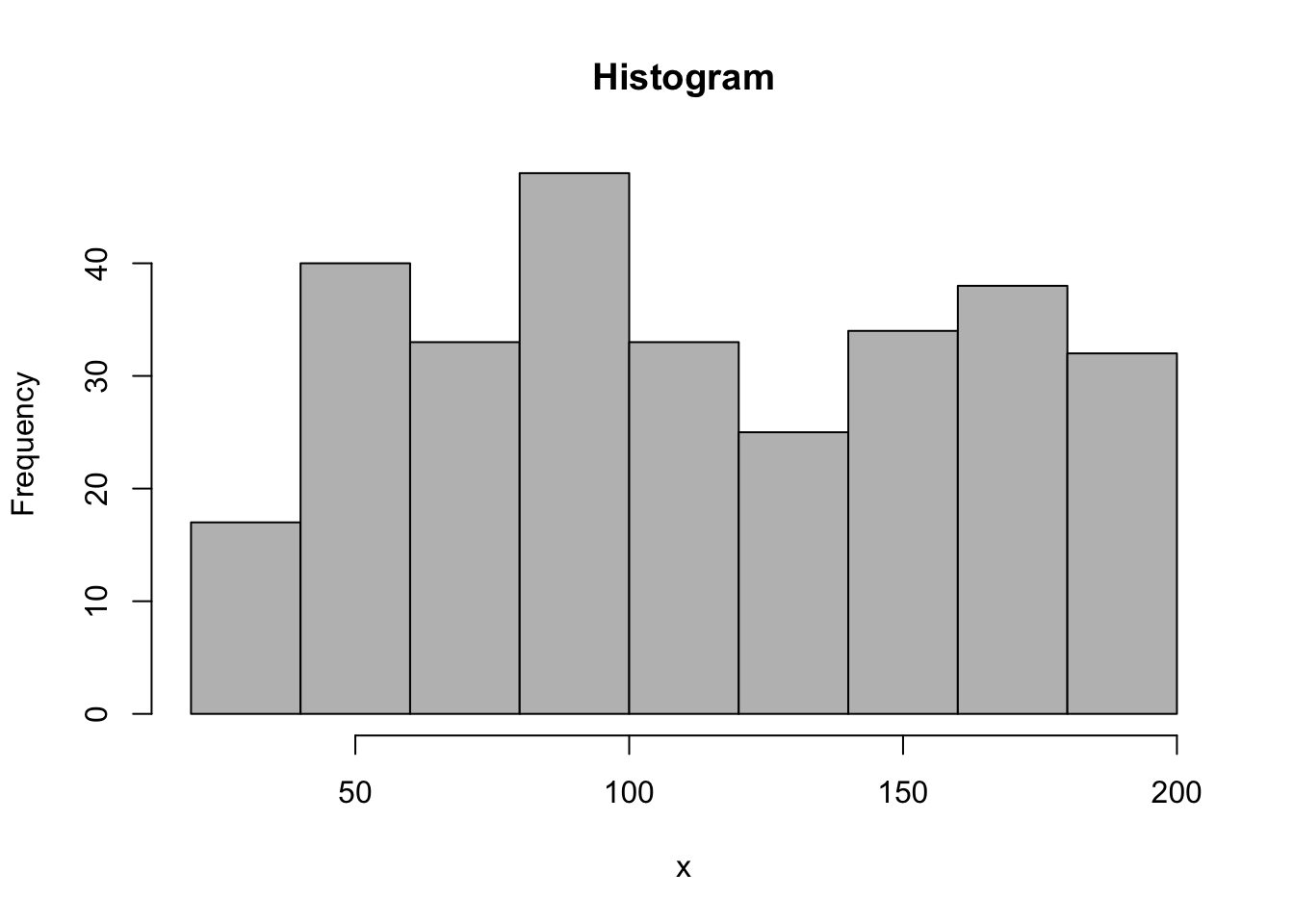
x <-runif(300,30,200)par1 ='Sturges'#number of binspar2 ='grey'#colourpar3 =FALSE#right-closed intervalsxlab ='x'main ='Histogram'myhist<-hist(x,breaks=par1,col=par2,main=main,xlab=xlab,right=par3)
To create a Histogram, the R code uses the hist function to produce the plot. The dataset is simulated with the runif function as a series of random numbers (N = 300) from the Uniform Distribution with a lower bound of 30 and an upper bound of 200.
62.11 Purpose
The Histogram can be used to graphically examine the distribution of the data. The following properties of the distribution can be visualized by the histogram: central tendency, variability, skewness, modality, and the presence of outliers.
62.12 Pros & Cons
62.12.1 Pros
The Histogram has the following advantages:
It is easy to compute with many software packages (even spreadsheets have functions which allow to create histograms and associated frequency tables).
It is relatively easy to interpret and conveys a lot of information in a simple graph.
Many readers are familiar with histograms -- therefore it is one of the preferred methods to report information about the distribution of a variable of interest.
62.12.2 Cons
The Histogram has the following disadvantages:
The Histogram groups the original observations into bins which implies that some information is lost. In the Histogram each observation is represented by the center of each bin.
The amount of information that is conveyed depends on the bin size (and the number of bins). Bad choices for the number of bins may conceal distributional features (such as multi modality, central tendency, variability, etc.). Common rules for choosing the number of bins include Sturges’ rule (Sturges 1926).
With discrete variables (such as scores on a Likert scale) one must be careful when interpreting the results (because it is possible that all observations are located on the lower or upper bounds of the bins). It may be beneficial to choose bounds in such a way that the observations are all in the center of bins.
In the presence of outliers, the histogram may not be very informative. Trimming the outliers from the dataset may be necessary to solve this problem.
62.13 Examples
The Histogram shown below represents the time that was needed by students to submit a survey (in seconds). This Histogram is not very informative because there are several outliers on the right side of the scale.
The Histogram shown below represents the scores on a 7-point Likert scale from a survey. The bins have been chosen in such a way that the actual scores (1, 2, 3, 4, 5, 6, and 7) fall exactly in the center of each bin (observe how the field “Scale of data” was set to “7-point Likert”).
Use the first Histogram of Section 62.13 and identify the average time that is needed to submit the survey. There are (at least) two different ways to do this!
62.14.2 Scale of the data
Use the second Histogram of Section 62.13 and set the “Scale of data” field to “Unknown”. Compare the results with the original ones. Which histogram is easier to interpret? Why? What if you set the number of bins to 6?